Gary
Author Comments aka Comic News
Denver Comic Con find


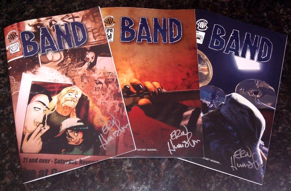
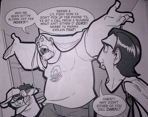
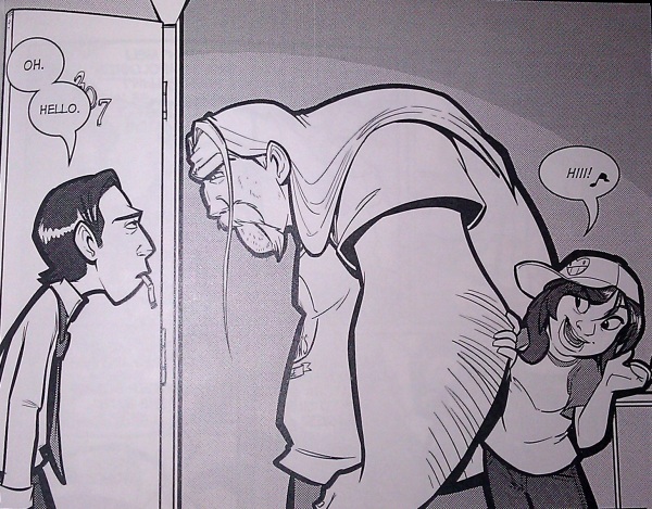
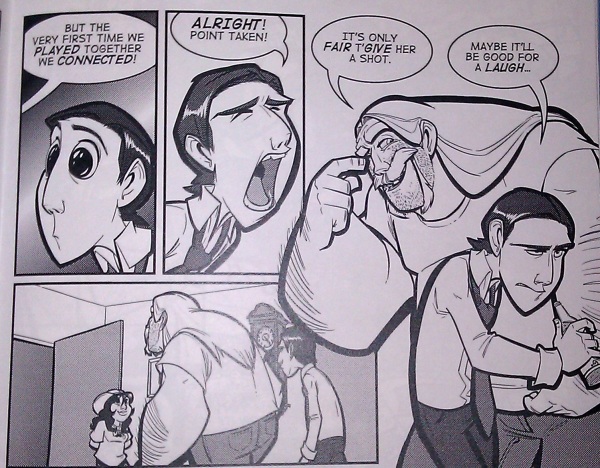
So, at a comic book convention, I rarely have time to really determine if I'm going to like a story, so I base most of my decisions on whether or not I like the art, or whether or not I can learn something from the art (sadly, this probably means I miss out on a lot of good stories). Now a days, both are valid reasons for me to pick up a comic, and if it's a web comic collection, I can normally ready a few strips to see if I'll enjoy it or learn something from how they craft their jokes or stories. This comic, Band, I picked up at Denver Comic Con. I thumbed through it, and I was really impressed by the inking/line weight work (as you've seen, in the last two comics, I'm trying to learn from it), and I was impressed by the expressiveness of the figures/forms. After I got home, I read all three, and I was really delighted by the story Christine Humiston wrote and how Erin Humiston (the artist) playfully broke up the pages, as slightly seen in the last image there. In all the images, you can tell immediately, from the characters drawn, what the mood of everyone is. Also the very think and clean line weights on foreground characters tends to make the panels pop for me. Both of those things are things I hope to partially incorporate into this web comic's style. Now that I've talked about the art, the thing that caused me to pick up and purchase the comic, I'll talk a little about the writing, the thing that's going to make me look for more issues and continue buying. Sadly, I can only go into vague details, so as not to cause spoilers, and I really don't want to cause spoilers, because (at least to me) half the fun of this comic is seeing how the characters act and how it plays out. High level, this comic is about a small local/garage band and how they interact. All the characters are unique, by that I mean, within the group, no two personalities are the same. This allows them to play off each other, support each other, and occasionally keep each other in check. The dialog flows naturally and doesn't feel forced into the situation. I'm really quite enjoying it, and I recommend people give it a try, but don't expect explosions and chases and super villains. It's not that kind of comic. It's also marked as "for mature readers". So far, I think that's just for language, and some adult situation conversation.
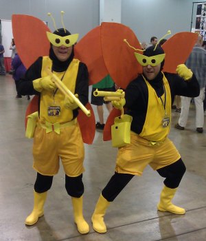
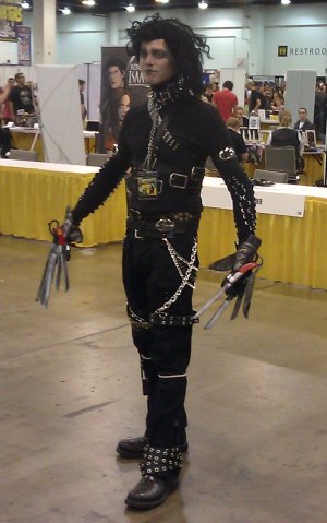
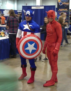
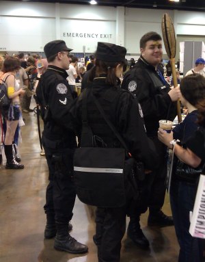
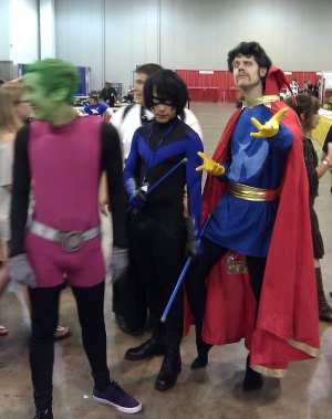
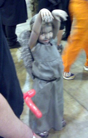
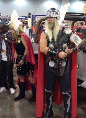
And now, here are some more Denver Comic Con pics.


So, this wasn't actually the original text for this comic. In fact, it's a completely different feel that what I started with, but, while I was doing it, I zoommed out to see how the comic was cominc, and I was struck with that I thought was a better idea. Hopefully all of you agree. Here's what the original text was going to be, and panel one would have had the other employee in it too.
Jacob: Hey, you worked on the stock trade app we wrote, right?
Phil: Why do you ask?
Jacob: I was trying to figure out how to set it up on a test client, and I thought you could help.
Phil: Have you tried using the setup manual?
Jacob: We have one of those?
Phil: Yeah, I wrote it. Let me get it for you.
Phil blows off the dust
*THUMP*
Phil drops the tomb on Jacob's desk
Phil: Enjoy!
That joke was supposed to be more about how it's a twelve hundred page manual just to setup an app. Where as this one goes out to all the people who don't read manuals, with a little jab at them being massive tomes.
Cool quote
Great quote from the commenter Don Lindell on this Forebes article:
"You can't beat the house, you can't fight city hall, don't poke the mask of the ol' Lone Ranger and you don't piss off the internet."
|
